Brand Identity
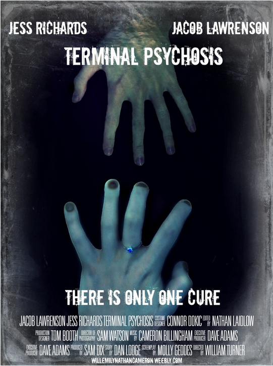
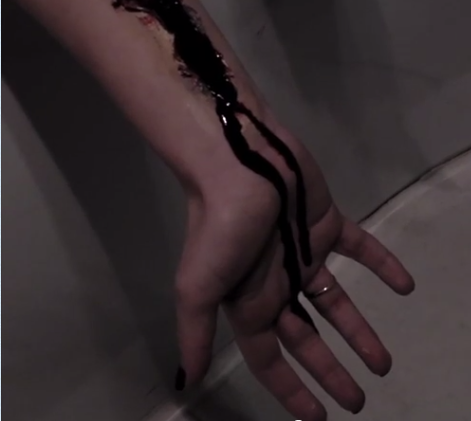
We picked our brand identity by coming together as a class and watching the trailer, we then decided what was the most prominent image in our trailer was. It was decided that the most memorable image was the image of the yuri's hand in the the bath. Once we had this information, we were able to incorporate it into our poster and magazine cover. Our poster we focused mainly on the hands with the yurei and Jacob's hands seemingly reaching towards each other. Our magazine was a little more subtle in that the Yuri's hand was reaching across Jacobs chest, although the hand is more pronounced as it stands out against Jacob's grey shirt. This shows that the hand is the most recognisable feature of our trailer. (NL)
