Poster Sub-genre analysis
When researching horror posters we found that their has been a remarkable development as the years have progressed. Therefore we decided to analyse the contrast between then and now in some of the main horror sub-genre's. This will be useful when deciding what style of poster we want to use when creating our own.
(WT)
(WT)
Zombie
1932
|
2013
|
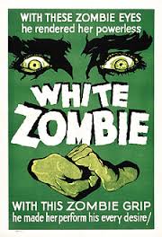
The poster of 'White Zombie' (1932) implies that it is a monster movie rather than a Zombie apocalypse, so it is much more toned down in the stature of modern day Zombie films ( less Zombies). this is probably because of one pair of eyes and hands shows that only one Zombie is needed to make the film scary enough to terrify the audience.
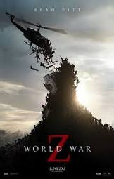
On the other hand, the poster for 'World War Z' (2013) displays a large amount of zombies attacking together, this contrasts with 'White Zombie' as more zombies are necessary to make the film more effective, tapping into modern day fears of widespread diseases.
To conclude, the posters of Zombie films tend to focus more on the monsters than the protagonist.
(WT)
Paranormal
1973
|
2011
|
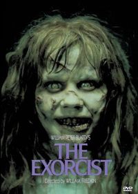
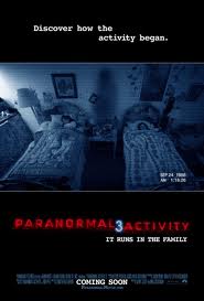
The poster for 'The Exorcist' (1973) implies that it is religious based from the title which is a religious term for removing demons and how that would affect the people in the film based on the face of the main focal point of the poster whereas 'Paranormal Activity 3' (2011) is more realistic and tries to paint the picture of a normal suburban family thereby making it more relatable to the audience, also the children in the poster are the main focal points of the film, this makes the fear more real despite the premise being ludicrous.
To conclude, both film posters focus on the innocence of children being shattered by a paranormal presence.
(WT)
To conclude, both film posters focus on the innocence of children being shattered by a paranormal presence.
(WT)
Phychological
1980
|
2001
|
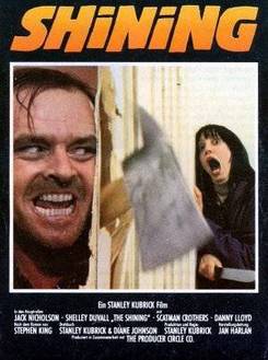
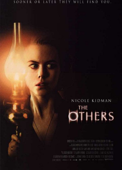
'The Shining' (1980) uses a split screen poster to focus on the different emotions of the main characters. The main focus is on the fear of the victims face, this is similar to 'The Others' (2001) poster as the fear from the audience comes from the reaction reflected by the expression on the protagonists face. The style of 'The Shining' poster is a complete contrast to that of 'The Others' as the layout is more directed to the era in which it was made. With the use of photoshop today, films like 'The Others' can use Photoshop to stage scenes for the poster which dont appear in the film. However 'The Shining' uses shots from the actual film to make their poster.
(WT)
(WT)
Slasher
1978
|
2011
|
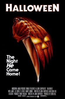
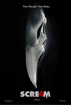
The main focus of the poster is the use of the weapon which is incorporated into the characters themselves. This is similar to the theorist Stuart Kaminsky who suggested that the killers weapons were so closely associated with them specifically they became an extension of the characters, themselves. The main focus of both posters in the killer suggested by the black background containing only the symbols which represent them.
(NL)
(NL)
