How effective is the combination of your main product and ancillary texts?
When creating our media product and ancillary texts we wanted a consistent theme across all three of our products, to do this looked at various examples in horror genre which are instantly recognisable. The better branded our product is the more recognisable and iconic among other other competitors.
iconic branding images
|
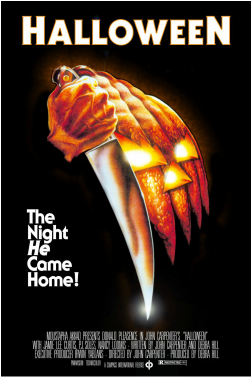
This is comes to mind for most people when they think of the Halloween films, the iconic kitchen knife used by the antagonist and the Halloween style mask along side it which is split into sections to artistically replicate the knifes shape in a mirror effect. This mask, although not featured on the actually antagonist is still iconic as it corresponds well with the title as a pumpkin is already an iconic image of Halloween. Another iconic image of the Halloween films is the mask the antagonist Michael Myers wears, this image would be the image appearing on the poster of the sequels. Despite the mask's lack of features and rather plain look it is very memorable and anyone who has seen the films will remember it and instantly associate it with the films. This shows that for something to be iconic and memorable it needs to be simple and/or relate well to the title.
|
|
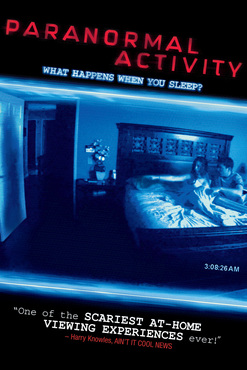
The Paranormal activity films have also managed to attach an iconic image to there branding, that being blu tinted CCTV footage of which most of there films consist of. This has become an iconic image of the seres as when this kind of found footage style of filming is shown in the blue tint colour most people will think of paranormal activity even if they have not seen all of the films. The actually picture shown is less important as long as it is in the iconic style, however like other posters it is important that it relates to the title and/or involves some sort of action, this is needed for the image to stay in the minds of the viewers which is crucial to a films success.
|
|
|
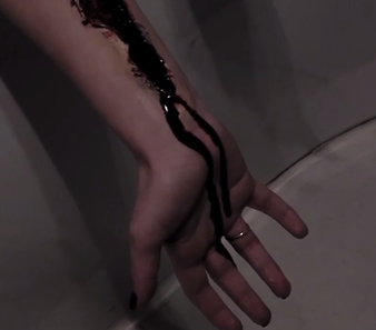
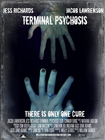
For our poster we chose to use a hand as our iconic image in our poster as it's simple and easy to remember, it is also a predominant image in our trailer. Hands are also good to use as they are easy to use when conveying different emotions and situations, in this instance the hands represent the connection between the two characters and the depth of darkness the extent of insanity. The poster depicts the Yurei trying to drag the man into despair and insanity where she lies. On the yurei's hand she is wearing a ring this is good for iconic imaging as it makes the hand stand out while also giving the it much more character, mostly innocence and despite being small it gives the poster much more character and makes it more interesting.
|
Fonts
|
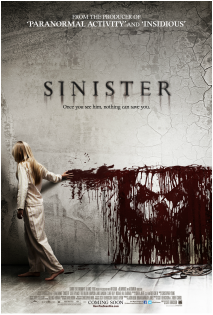
The movie title immediately exhibits to viewers of the poster what genre the film is, and therefore what to expect from it. The film title itself Sinister is a title one would usually associate with that of a horror film. This idea is then reinforced by the font used, as the black font colour and the smearing gives the movie title a dark, dingy, and indeed sinister ambience. This is then backed-up by the tag-line underneath, which immediately implants a sense of danger in to the viewer of the poster, as they are threatened that once they see the film’s antagonist, nothing can save them. My only criticism of the tag-line is the font in which it is written, which is basic and is a general font found on Microsoft Word, as opposed to a unique font developed for the film.
|
|

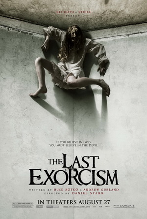
The Last Exorcism (2010) used the font name "Requiem" as there font, this use of font was quite iconic towards the film by being simple yet still standing out a lot and still grabbing the attention even though your main focus is on the rest of the photo. The colours used on the poster and title are very similar to each over with the horror use of a black text on a white background or the other way around, it creates a bold strong title but sticks out without going over the top. Overall we liked the style of which they used to do there poster so when we came to picking our text for our poster we stuck with a similar style to them, as it is iconic and was very effective for the film.
|
|
Magazine Covers
The one consistent thing about these magazine front covers is that they all display a single dominant figure who is in character with the film, the cover is also very clustered with many other advertisements on whats inside. despite this the character remains dominant, the character advertised on the front cover is most likely the most recognisable character in the film/series such as Captain Jack sparrow from the Pirate of the Caribbean Films and The Joker from the Batman Films.
|
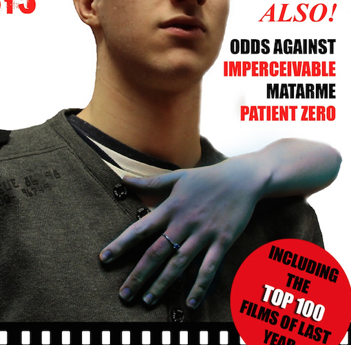
We tried to replicate this with our Magazine, first of we tried to keep a constant theme throughout all of our media products that we created that being the iconic image which is the Yurei which is a predominate image throughout all of them. We also feature our main character as the single full figure on the cover and it is arguable whether he is in character or not as he is not distinctive, this is in part how we have differed as rather than having the focus be on the character who covers most of the magazine the focus is on the Yurei's hand. To make our magazine cover more authentic we include many features found on real magazine covers such as Quotes from interviews, an "Also" section advertised and advertisement of other films/trailers.
|
|
|
|
To conclude, I believe the combination of our main products and our auxiliary text is very effective mainly down to the fact that we were consistent with the imagery used across all four of our products. This being the use of the yurei's hand as the predominant image, firstly in the poster in which there is an iconic scen in which the hand can be seen hanging out of the bath, secondly in the poster in which it features as one of the hands reaching out and finally the same hand features on our poster reaching from behind the protagonist. The hand is supposed to represent desire and despair, but what makes it more memorable is that not only is it featured in all of media products but its image also stays consistent as it always adornes a very distinctive blue ring which despite its small size is a very predominant image.
